Budget Matters Blog
Entries By Becky Sweger
Post-Election NPP: The 114th Congress and Beyond
By
Becky Sweger
Posted:
|
Transparency & Data

No matter who's in office, NPP will continue its pursuit of a transparent, accessible federal budget.
Senate Races, Gubernatorial Races, and State Smart
By
Becky Sweger
Posted:
|
Transparency & Data
Election 2014 is almost upon us. "Interest, amuse, and amaze yourselves between campaign commercials" with State Smart.
New Open Federal Spending Data: Week One
By
Becky Sweger
Posted:
|
Transparency & Data
One week after launch, NPP presents hard-hitting analysis of the most popular State Smart states.
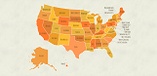
State Smart: Better Federal Budget Open Data
By
Becky Sweger
Posted:
|
Transparency & Data
NPP launches State Smart and ends a dark time for federal spending data.
NPP to U.S. Treasury: Here's Why Spending Data Matters
By
Becky Sweger
Posted:
|
Transparency & Data

NPP presented its outside-the-Beltway perspective on federal spending data to the U.S. Treasury Department.
State Smart: Federal Grants to Your State
By
Becky Sweger
Posted:
|
Education,
Health Care,
Transparency & Data

Today's State Smart preview spotlights federal grants that go directly to state governments and ultimately affect people in our communitites.
State Smart: Income, Business, and Other Taxes in Your State
By
Becky Sweger
Posted:
|
Taxes & Revenue,
Transparency & Data

NPP profiles another State Smart dataset, this time highlighting state federal tax contributions.
State Smart: Cost of Military Contracts, Your State, and the Election
By
Becky Sweger
Posted:
|
Military & Security,
Transparency & Data

As the first in a series of releases leading up to State Smart, NPP profiles federal contract spending in the states, with a spotlight on the Department of Defense.
Billions of Dollars Missing From Government Spending Website
By
Becky Sweger
Posted:
|
Budget Process,
Transparency & Data

The Government Accountability Office recently found that $619 billion in federal grants and loans was improperly reported in 2012.
Localizable Federal Budget Data: What Does Your Community Spend on Education, the Iraq War, Foreign Aid, and the Debt?
By
Becky Sweger
Posted:
|
Military & Security,
Transparency & Data

What’s the cost of the Iraq war to taxpayers in your town? If you could reallocate those tax dollars, what would you buy instead? NPP's easy-to-use, localizable federal budget data can answer these questions and many more.