Announcing Per Capita Spending Data
By
,
Kris Elinevsky
,
Jo Comerford
,
Chris Hellman
,
Samantha Dana
,
Becky Sweger
,
Mattea Kramer
,
Robin Claremont
,
Guest Blogger
,
Max-Edouard Mondesir
,
Jason Leveille
,
Board Member
,
NPP Intern
Posted:
|
Transparency & Data
We’re happy to announce that our expenditure datasets now include per capita numbers. In other words, you can see the amount of money spent for each person who lives in a state or county.
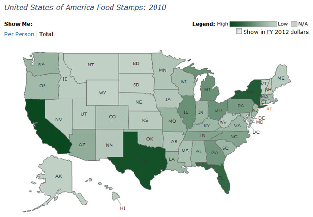
Why is this important? Below is a map of federal food stamp spending in FY 2010. Using the map’s legend, you can quickly see that California received the most money for this program, followed by Texas, New York, and Florida.
And here’s a map of FY 2010 State Children’s Insurance Program (CHIP) spending. Again, California and Texas got the most funding.
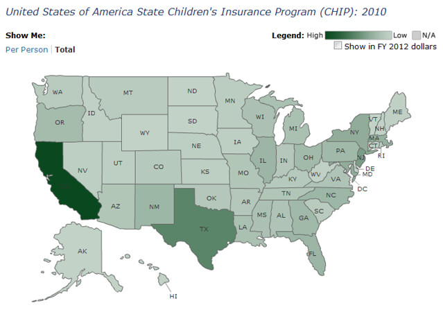
In fact, the majority of total spending maps highlight California and Texas, simply because those states are the most populous.
By adjusting the total dollar amounts for an area’s population, we get a different picture of where the money is going. Here’s the food stamp map again, this time using per capita amounts:
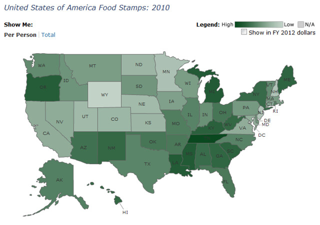
This time, Tennessee emerges. Because the food stamps dataset contains county-level information, you can click on Tennessee to get a picture of per capita spending in its individual counties:
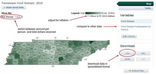
And because the per capita amounts are included when you download the data to a spreadsheet (just click the CSV button), you can look at it any number of ways. Adjust for inflation and track per capita spending over time, calculate the percentage of change from year to year, and compare to other data.
We’re always looking for ways to make the Federal Priorities database more useful to those who have stories to tell. Please drop us a line and give us your suggestions.