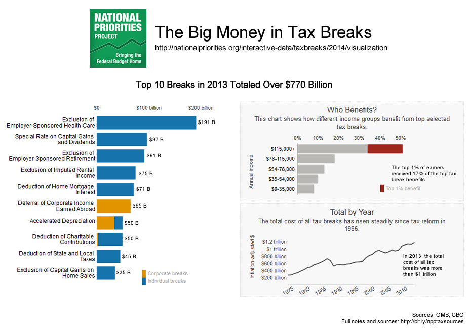
Visualization: Big Money in Tax Breaks
The federal tax code includes hundreds of tax breaks designed to encourage certain activities that lawmakers deem beneficial to society. Tax deductions, credits, and exclusions are all different kinds of tax breaks. Tax breaks result in fewer revenue dollars collected by the U.S. Treasury. This visualization, based on NPP’s tax break dataset, shows some of the most expensive tax breaks, who benefits, and how their costs have changed over time.
Loading...
| Corporate breaks | |
| Individual breaks |
| Top 1% benefit |
Numbers updated April 2014 to reflect the latest Treasury Department tax break estimates.
Data sources: OMB, CBO. Full notes and sources here.
You can download NPP’s tax break dataset here.
Read our report exposing the Big Money in Tax Breaks.