Data Wednesday: Normalizing
By
Becky Sweger
Posted:
|
Transparency & Data
This is the latest entry in NPP’s weekly Data Wednesday series, a getting-started guide to NPP’s Federal Priorities Database. All previous posts are archived here.
When looking at data, you may hear or read the phrase normalization. Simply put, normalization is transforming a set of data so that they may be compared in a meaningful way. Still sounds geeky? Although you may not realize it, you use normalized data all the time.
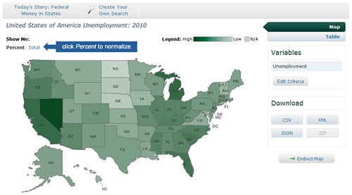
A common example is unemployment numbers. Knowing the total number of unemployed people in an area is interesting, but it isn’t enough information to compare numbers across geographies or time. For example, the database shows that in 2010, Nevada had 200,772 unemployed, and Arizona had 316,188 unemployed. So Arizona had higher unemployment, right?
Actually, Arizona has more people in its labor force—the total population of people who are working or are looking for work. So when you divide the total number of unemployed in each state by the total number of people in the labor force, it turns out that the picture is bleaker in Nevada (14.9 percent) than Arizona (10 percent).
This process of adjusting the unemployment numbers to factor in the size of the labor force is normalization. How do you know when data has been normalized? A few key words to look for are percent, rate, ratio, per-person, and per-capita. We try to show as much normalized data as possible, so you can look at trends over the years or see how your state or county compares to other parts of the country.